One of the things I enjoy most about logo design is finding the detail that makes a brand feel personal — something that goes beyond just looking nice and actually tells a story about who the person is. The Jill McCulloch project was a perfect example of that.
Jill is a public speaking coach based in Cambridge. She helps leaders communicate with confidence, drawing on over forty years of business experience and twenty years as a Co-Active Coach. She’s also a keen rower, she’s tall, she’s full of energy, and she has a background in theatre and drama. All of those things matter when you’re designing a brand for someone — the logo should feel like them.
The Logo — Oars Hidden in Plain Sight
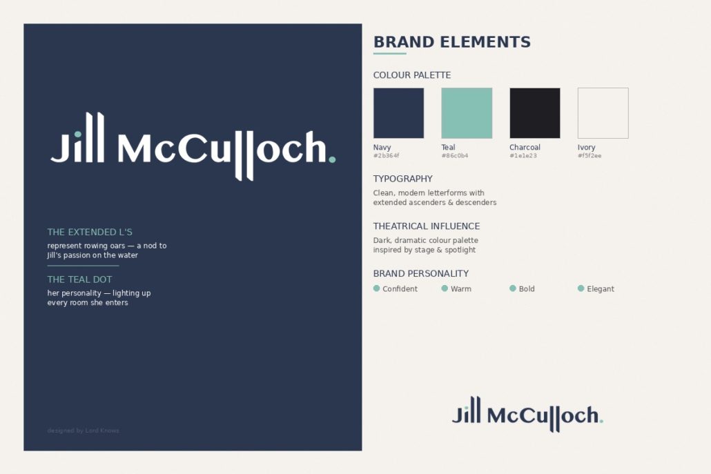
The Jill McCulloch logo is a custom typographic wordmark built entirely around her name. The key design detail is the L’s. Jill’s name has a lot of them — two in ‘Jill’ and two in ‘McCulloch’ — and I extended those vertical strokes so they reach above and below the other letters, like oars cutting through water.
It’s a nod to Jill’s love of rowing, but it does more than that. The extended strokes give the logo a sense of height and presence — which suits someone who is tall, confident, and used to commanding a room. The rhythm of those vertical lines across the full name creates a visual tempo, almost like oar blades moving in unison. It’s the kind of detail you might not consciously notice at first glance, but it gives the logo a feeling and energy that a standard wordmark wouldn’t have.
A small teal accent dot finishes the wordmark. It’s a subtle touch of warmth and personality — a nod to Jill’s ability to light up a room.
The Colour Palette
The palette is built around deep navy and charcoal as the primary colours, with muted sage and teal greens as accents. It’s a combination that feels confident and authoritative without being corporate or cold. The dark tones give the brand a theatrical quality — think stage lighting, the moment before a performance — which ties into Jill’s drama background and her work helping people deliver impactful presentations.
The teal accent adds warmth and a point of visual interest. It picks up beautifully against the dark backgrounds and connects the brand identity across every touchpoint.
How It All Comes Together
The brand identity carries through consistently across the website at jillmcculloch.com. The dark hero section, the clean typography, the signature teal green running through headings and accent elements — it all feels cohesive and intentional. The overall impression is premium, calm, and self-assured, which is exactly who Jill is and exactly how her clients want to feel after working with her.
It’s a brand that would translate well beyond the website too — presentation slides, event programmes, social media graphics, even rowing club kit if she ever wanted it.
See the full brand in action: jillmcculloch.com
Need a logo that actually means something? I design brand identities that tell a story — not just ones that look good on a business card. Get in touch and let’s talk.